Student project
WeVOTE
Objective: As the 2016 election neared, my classmates and I wanted to put our design skills to good use. Using our UX process, we wanted to solve user paint-points related to voting to increase turnout. We wanted to build a digital solution in the form of a mobile app experience. We proposed a group project to our UX Design course and received approval to move forward.
Success: Iteration of a voter registration feature to positive user feedback and testing.
Team: Ramon Martinez, Rami Hamdan, Jason Chatz
Role: UX Designer, Information Architect, Project Manager.
UX Tools: User Surveys & Interviews, C&C Analysis, Card Sorting, User Flows, Paper Prototypes, User Personas.
High Fidelity Mockup of the WeVote App Home Screen
Design Stack: Sketch App, Adobe Illustrator, Invision.
my PROCESS
1.Discover | 2.define | 3.iterate
1.DISCOVER
User Research
In our research into pain points around the voting process, we discovered an interesting fact. Millennials (those born between 1980 and 2000) are the largest group of eligible voters by generation, yet they vote at the lowest rates. What were the pain points of voting for millennials? How could we create a solution to increase millennial voter participation?
This was an accessible population that we knew well, so we decided to focus on millennials.
NY Times Findings
NY Times findings
USER SURVEYS & Results
To discover millennial pain-points and requirements for a solution, we spoke directly to our target users through a user survey and user interviews.
- We targeted users above the voting age of 18 and under the age of 36, the technical definition of millennials.
- We sent out our survey on social media and quickly received 56 responses in under 48 hours.
- We did 5 follow up interviews with those respondents who could fit into our sprint schedule.
challenge
Not surprisingly, respondents were severely disillusioned with voting (as seen below). This validated our research: the large UX opportunity to solve serious voting pain-points. But this also presented a challenge for us--we were unsure if we could discover a solution for such a poor voting experience. We thought we had a bad idea and had wasted our time...
User Interviews
To overcome the challenge of users extremely negative views of voting, we relied on our UX process. We conducted user interviews to dig deeper; we had to figure out why users really felt the way they did.
Excitingly, when asked what we could do to help solve their frustrations with voting, we discovered users had consistent needs that they weren't getting from the voting experience. These would be our requirements moving forward with our process:
They wanted an easier way to register and view information for upcoming elections.
- But they also wanted to feel more connected with politics and politicians.
- They wanted to know more about the issues and the candidates.
- And they wanted to engage with relevant news and events surrounding an election.
2.define
Competitive analysis
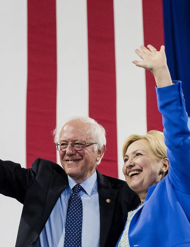
In our interviews and survey, users revealed their favorite news sources and several direct competitors. We investigated these websites and apps to see if they were helping users solve their pain points and meeting their needs.
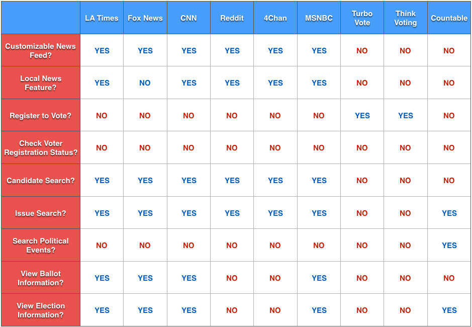
We found that none of these sources did more than a singular function, either providing news or registering people to vote. They were not coupled with other features that solved users needs around the entire voting experience.
If users knew about other these sources, but still felt so negatively towards voting, we knew we found an opportunity to improve the voting process through UX. If we could design a compelling experience for our users, we could provide serious value while gaining the upper hand on the competition. We knew this could help us reach our overall goal of increasing millennial voter turnout.
USER PERSONA
User STATEMENTS
We created the following user statements and the above user persona from qualitative and quantitative data in our surveys and interviews. Thse would help define our design decision-making around which features would get Millennials voting. We used the classic interrogative words to complete the picture (5W's+1H).
"I don't vote regularly, but I would if there was an app that...
HOW: "Let me register to vote and view my registration status."
WHERE & WHEN: "Showed me where and when I can vote next."
- WHO, WHAT & WHY: "Gave me information about a candidate or an issue on the ballot."
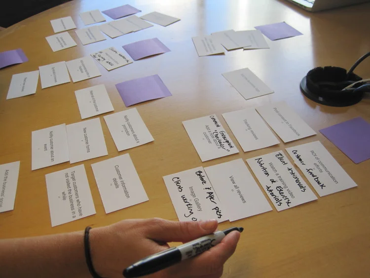
Card sort
We brainstormed features and flows, but wanted to validate that they were really what our users needed to solve their frustrations. We took several feature concepts and grouped them through card sorting to better refine our information architecture and menu structures.
USER FLOW
We took the results of our card sorting and our user scenarios and combined them into a synthesis of how users would most likely flow through our app.
MVP
If we could utilize our UX process to create a compelling experience that cohesively solved several of our users pain-points, we could provide serious value to them while gaining the upper hand on the competition. From our Discover and Define phases, we knew our user requirements boiled down to this; "Can I vote, and what am I voting for?" We had finally found the main features and solutions of our product.
3.iterate
Paper Prototype
Early sketches allowed us to lay out our four MVP features that would directly respond to user needs and problems:
- Register
- Vote
- Candidates
- Issues
We sketched the registration feature through the several screens outlined in our user flow. We took the best ideas of the apps we identified in our C&C, user tested and improved on where they came up short.
Wireframes
- Users responded extremely well to the simplicity of our home screen because they currently felt very confused by the voting experience.
- Our personal info page was short enough to overcome the initial hesitation users had to give their sensitive info.
- Users were excited to be able to get the relevant, complete, and authoritative info they needed in just 3 screens. We were building trust with them through our effective UX.
Hi-Fi mockup
We made several final changes upon a last round of user feedback to come up with our high fidelity mock ups (see below screens). We will continue to build out our MVP features as we move forward with further feedback.
We added icons to help users memorize and engage with our features and content.
We added a footer nav bar to help users better navigate between our 4 features.
We utilized bold colors that have been proven to calm yet motivate users towards their task completion.