student project
Muji
Objective: We were tasked with reimagining the Muji USA online store through a redesign. Using our UX process, we wanted to increase sales on Muji's site. We discovered the best way to do this would be to connect the online store with Muji's already strong branding which customers already trust and seek out.
Success: Our redesign performed much better with users. Our new screens and flow kept users better engaged and connected with the products and the Muji brand. And it prompted them to express that they were much more likely to make a purchase and revisit the store again.
Team: Ramon Martinez, Tina Vu, Carol Leung.
Role: UX Designer, Information Architect, User Interviewer.
UX Tools: Mood Board, Brand Prism, Contextual Inquiry, C&C Analysis, Heuristic Analysis, Site Map, User Persona, User Flow, Card Sort, User Interviews.
Design Stack: Sketch App, Adobe CC, Invision.
My Process
1.Discover | 2.Define | 3.Design
1.Discover
Mood Board
We had to first discover what the Muji brand was, what it felt like to interact with it. We created a mood board made out of several Muji ads. There were lots of compelling images that quickly made us realize Muji is a very visual brand. But it's also a brand interested in textures, and the speed of things, subtleties, colors and shapes. With such great branding, we were sure Muji could use this strong foundation to leverage its business goals of increasing online sales.
brand prism
We created a brand prism from analysis of Muji's ads and marketing materials. Using this textbook branding tool we began to feel very in touch with Muji as a persona.
contextual inquiry
We visited the Muji store in Hollywood. It was an amazing experience. The store was warm and inviting even though it was very large. We spoke to customers about the store experience. They confirmed what really connected with users; Muji's unique approach to a simplistic yet consumer-oriented experience.
"There was natural wood everywhere."
"It has a hushed, slow pace".
"It feels like a museum, or a private collection."
Muji store in Hollywood, CA.
When we compared the in-store experience with the web experience, we quickly recognized a harsh departure from the rest of the Muji brand. We immediately began to hypothesize that such a stark change from the rest of the Muji experience would scare off customers both new and returning.
Current Muji store home page.
C&C Analysis
We did a competitive analysis of 4 popular e-commerce sites that align with a broad swath of what Muji is known for; design oriented products, hip basic apparel, a wide variety of knick knacks. We found each of the home pages below speak much better to their company's brand experience than Muji. This was a standout competitive advantage that all the other sites had over Muji.
Poketo home page.
Forever 21 home page.
Forever 21 screams bargain brand with big sale ads and CTA's, which is exactly what it built an empire on.
Poketo wears its design cred on its sleeve with a very sleek minimalistic layout.
Amazon home page.
Free People home page.
Amazon puts products front and center in a somewhat overwhelming on stop approach.
Free People plays off of its breezy boho vibes with a look book or behind the scenes feel.
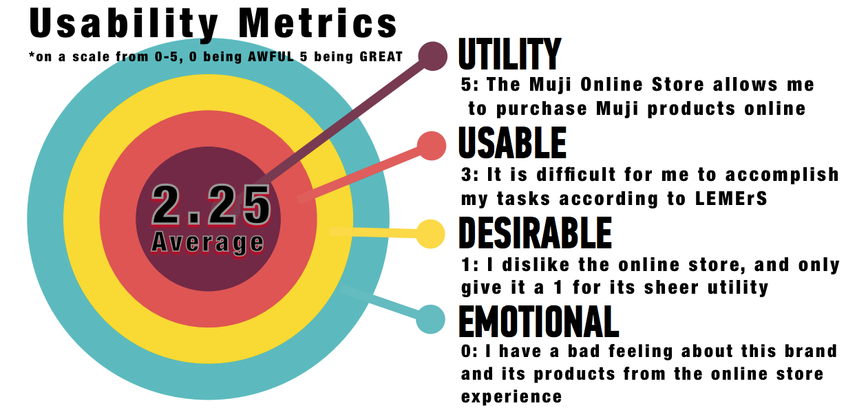
Heuristic Analysis
Utilizing a Neilson and Norman heuristic approach, we evaluated the Muji store for utility, usability, desirability and emotion. These factors are arranged in order of greater user experience, respectively. As well we graded each factor on a scale from 0-5. Needless to say the Muji store did not do well.
Site map
We dug deeper to see if there were information architecture issues affecting the Muji store. Surpsingly the Muji store was actually organized quite effeciently. There was not much redundancy or overlap, and most of the architecture was orderly and logical.
Click for detail.
Click for detail.
Findings
We were certain now that Muji's key to meeting its business goals was to simply listen to what customers and users loved about the brand. The way its calm visual and design aesthetic made them feel. The way that Muji seemed to have thought of everything. The way the simplistic product experience could plug right into the customer's lifestyle. If we could replicate this online, we could create real value for Muji and contribute to their success.
2.Define
User Persona
While researching Muji advertisements and marketing materials, we came across these personas. While they were a bit long winded, they were made by Muji themselves. Here was a great opportunity to peer behind the curtain at who Muji was really trying to speak to, both online and in-store. And we thought they did a great job capturing their users. To further bolster our business goals or connecting with users by reinforcing branding, we let these Muji made personas stand in for our project's user personas.
user statements
By synthesizing the qualitative data in our user personas, we were able to determine that Muji users already had a deep attachment to the brand and its products. Users wanted know quickly and affirmatively that the online experience was reinforcing the Muji brand experience.
- "Muji is one of the few brands that really speak to me. I love shopping in their stores, but the online experience is lacking. I want something that's easy to use but also engages me in the same way that the rest of Muji does."
user scenario
In our synthesis we crafted a user scenario for one of our personas that further materialized the above user statement.
- "Jenny is thinking of a couple Muji products she saw in-store that she would like to purchase online. She wants to be able to easily find and purchase them, and she wants to get the same fulfilling experience that her last in-store visit gave her."
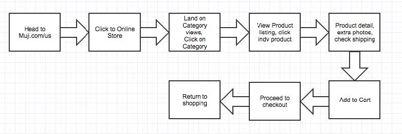
user flow
We crafted a simple, unobtrusive user flow to reflect the kind of calming experience Muji users would hope to find online. Bringing products up close and center, while focusing on their compelling roles in the Muji brand, would be another way we could drive business goals by connecting with users.
card sort
We conducted a card sorting exercise to try and narrow down Muji's current confusing menu structures and information architecture. On the left Muji's many categories and the products that live with them. On the right, the user sorted products now categorized into much fewer headings. Again, users were looking for a simple, uncluttered shopping experience that represented the Muji brand.
3.Design
Mid FI Screen
Due to project constraints and the amount of time we had already spent speaking to users and understanding the Muji brand, we decided to go straight to mid-fi screens. We pulled the best of the Muji brand together to reconnect its online presence to its users needs and tastes. We utilized the fantastic visual branding Muji had already done and put its products front and center with little between the users and Muji.
user Feedback
We put our redesigned screens in front of users to much more positive reactions. Users were much more engaged with the site, the products and the brand. They preferred our design much more over the previous design. They liked the new features that allowed you to better explore, view, and purchase a product. They did express the need for a better shopping cart and check out flow and we will be incorporating that into our next round of iteration.