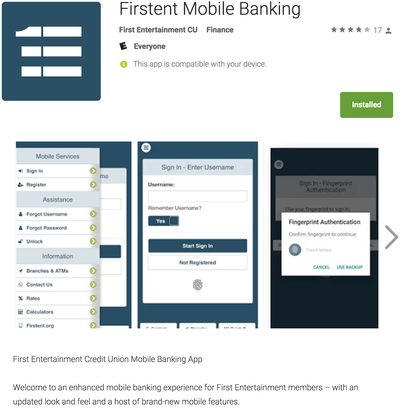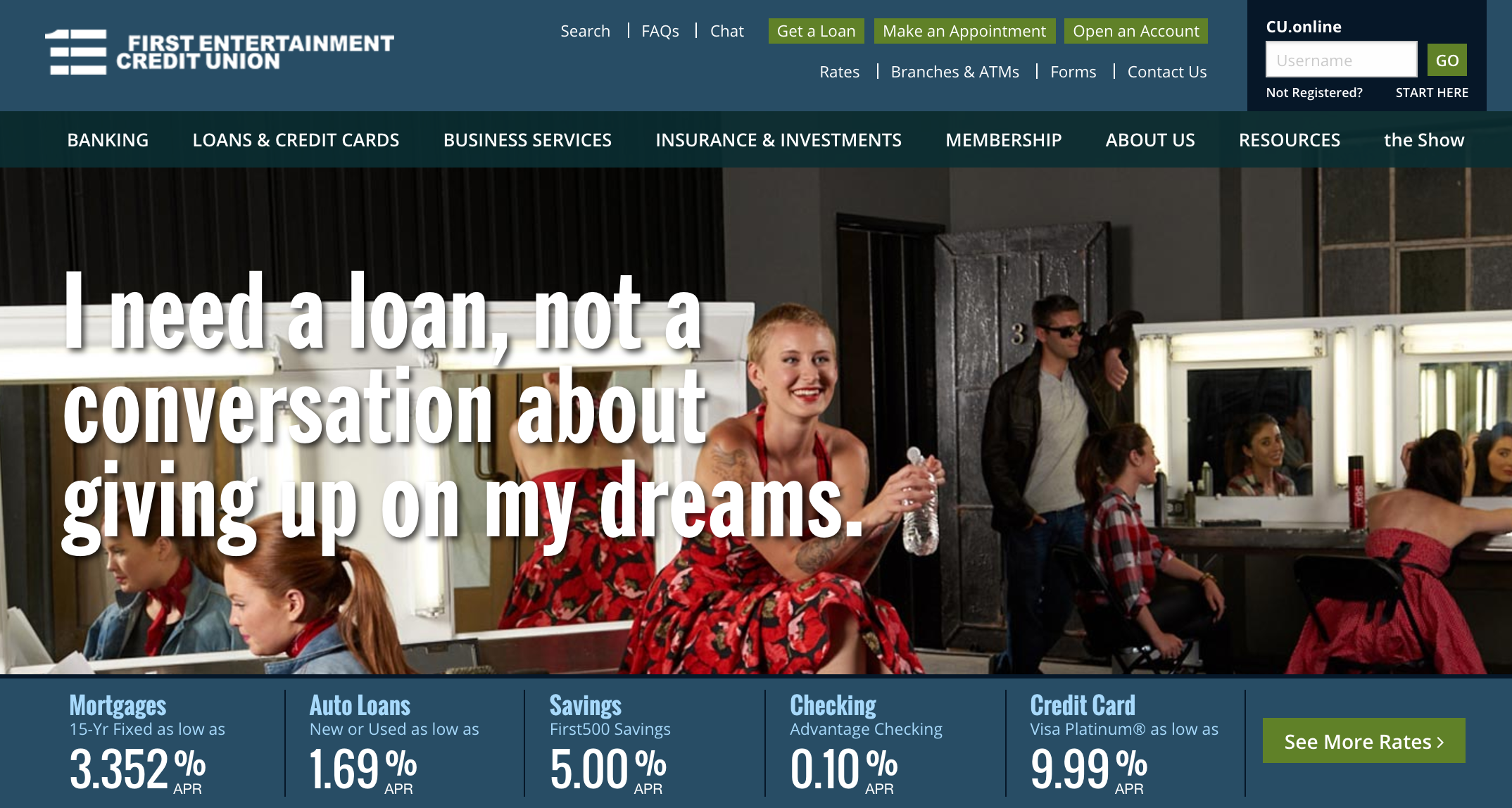
First Entertainment Credit Union
Mobile Design
1.Mobile deposit
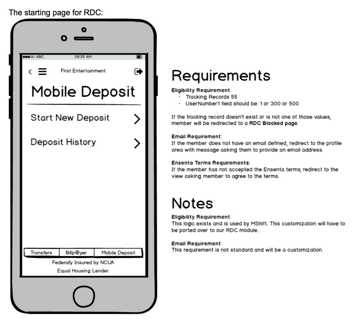
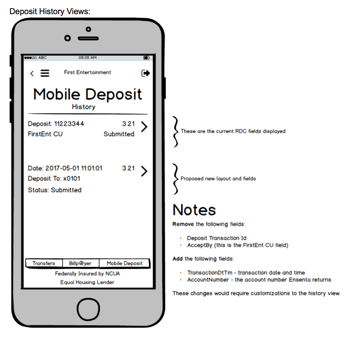
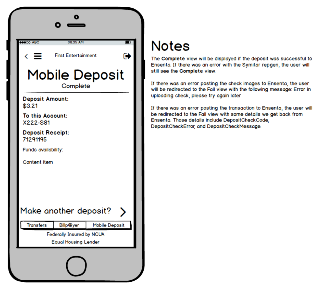
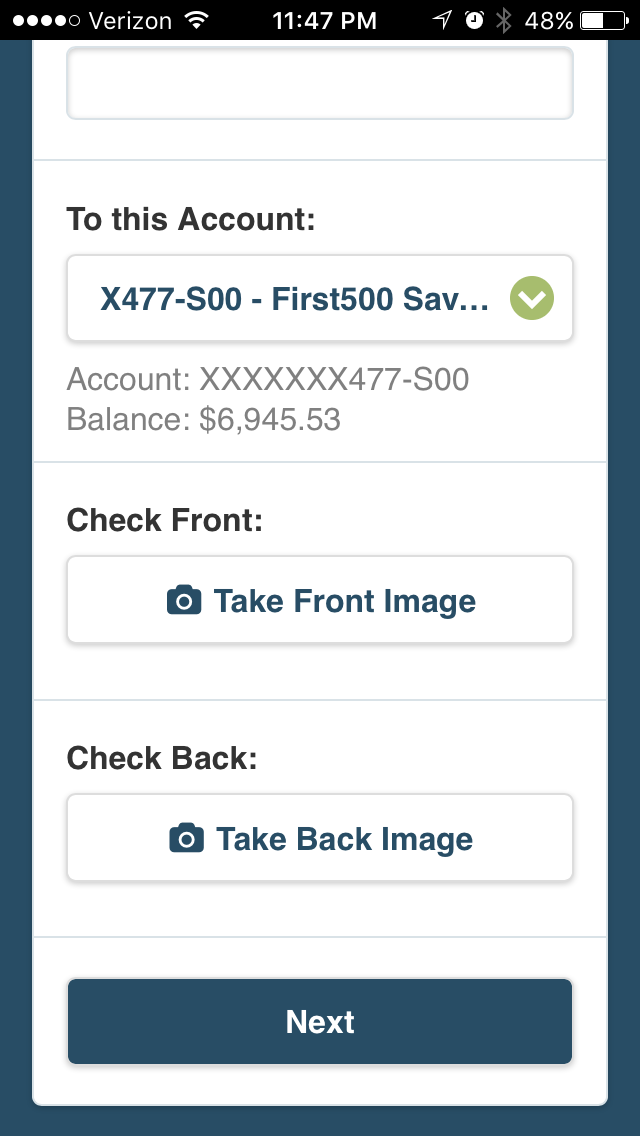
Seeking clarity: During the app update, our project team and remote dev team had developed bad habits. Poor documentation, confused terminology and tldr emails turned into increased billings and missed deadlines. Upon my arrival mid-way into the update, I immediately began teaching my team Balsamiq and insisted our developers do the same.
Same page: Within two weeks, we were turning rough sketches into low-fi screens. We'd send these to dev along with our business and internal technical requirements for each screen and flow. Dev would make notes and send the screens back and we would continue refining until we had decent spec docs.
Shared Vision: Visual and written aids allowed our technical conversations to go deeper. Impasses that felt insurmountable melted away. When we began speaking the same language, phone calls were far less tense and emails less cryptic. The qualitative improvements we were all feeling quickly turned to quantitative successes we could point to.
Results: Project timeline accelerated nearly 45 days. Final 30 days of project saw billings drop by 20%.
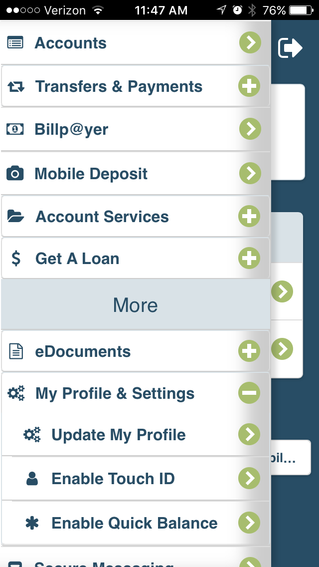
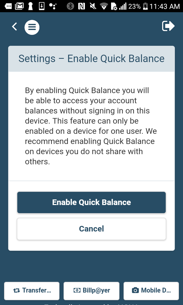
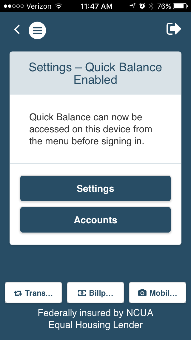
2. Quick Balance
Understanding the user: The key metric for the app redesign was increasing member engagement. In doing discovery work, I learned that 75% of our users are over the age of 45. Security and ease of use were the top two reasons members said they didn't use our old app. Analytics also told me that users were not venturing deep into our screens. Our middle aged users were skeptical of our mobile tech, preferring ATM's, phone banking, and in-branch alternatives.
A delightful experience: I wanted to wow members. But membership didn't express a need for anything flashy. I wanted something they would use everyday--easy but most of all secure. I knew if I could do this, I could get our skeptical membership engaged in our app.
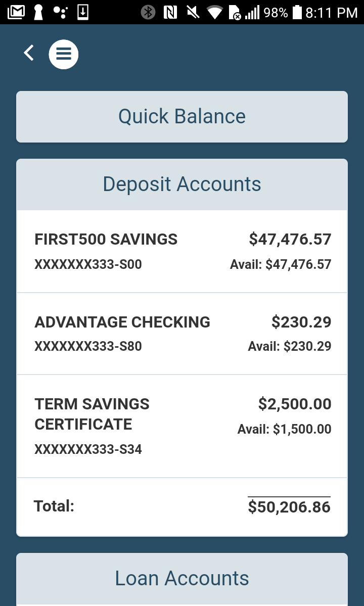
Comparative analysis: Looking at our competitors, one great feature that stood out was Quick Balance. Once enabled, users could view account balances and transactions without logging in and leaving their accounts open to compromise.
Buy-in and validation: I consulted with stakeholders, who liked the idea. I got the go ahead to work with our remote dev team. I sent over flows and low-fi screens and in two weeks we deployed in our test environment. I did some guerrilla testing with members in our local branch and received positive feedback. We refined the account information we were displaying, working with dev to customize the data we pulled.
Results: We deployed the feature with our app launch. 90 days in it sits in the top 3 most used features of our app. What's more exciting is our data shows members who use Quick Balance go deeper into our app, make more transactions and log in more often throughout the day.
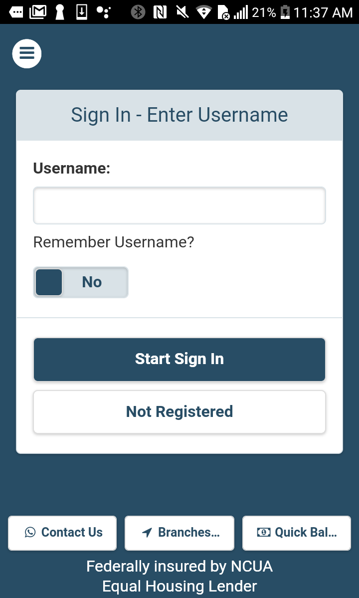
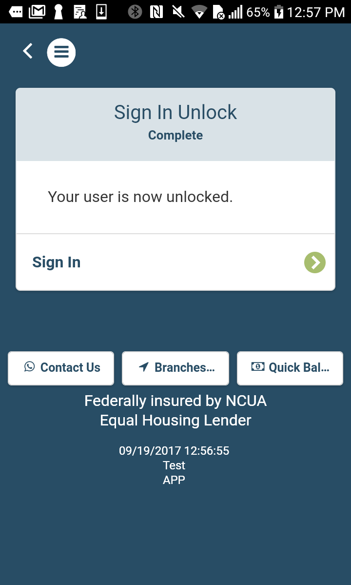
3. Account Self-Unlock
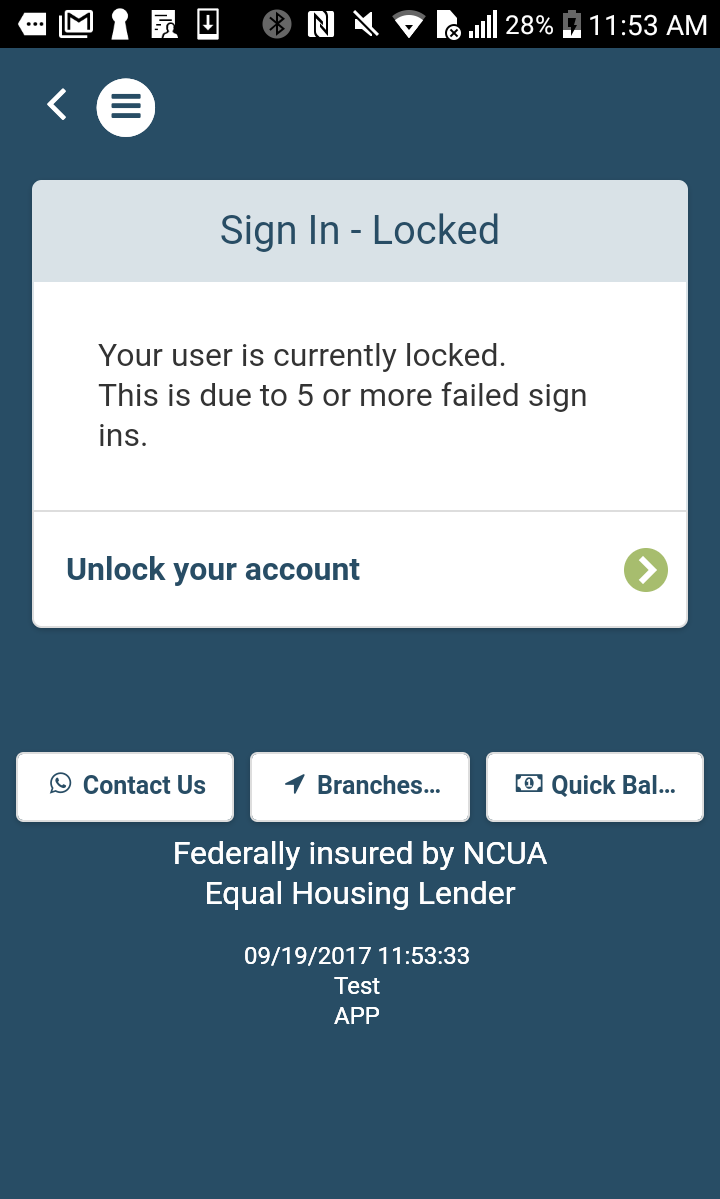
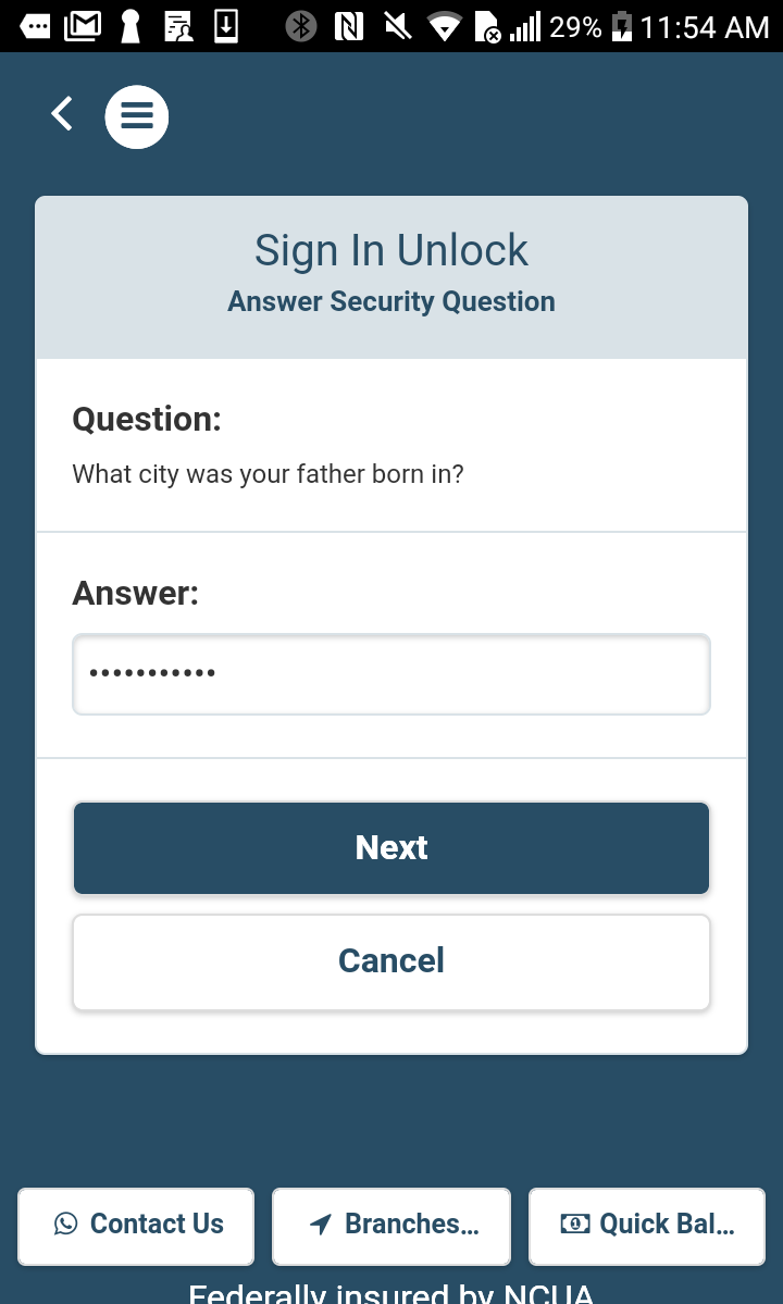
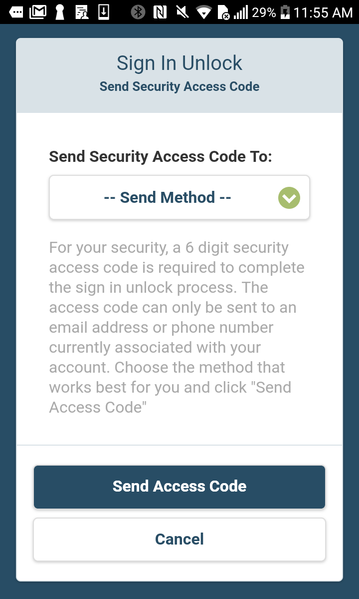
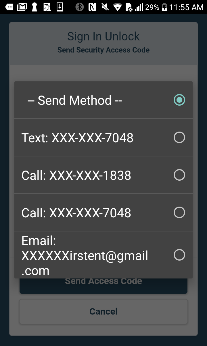
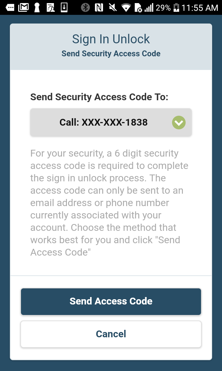
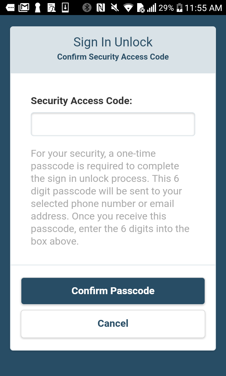
Business goals: I learned from our contact center director that 60% of after-hours calls were simply members calling to unlock their accounts after 5 failed login attempts. These calls were expensive because the after-hours vendor charged per call and by the minute. The credit union was even considering hiring our own after hours call staff, putting the solution before the problem.
User flows and feedback: I spoke with several users informally and they all said there should be an account self-unlock feature on our new mobile app. Users needed a way to unlock an account, and they wanted to do so with a one-time passcode sent to their phone. I began flowing out the process and came up with an initial design. I presented it to senior stakeholders and got the go ahead to work with dev. Since we already pulled much of the data and used it in similar ways elsewhere in the app, it was an easy build.
Results: In the 90 days since roll out we've seen after-hours calls drop 35%, with a steady drop recorded month over month. We are now in a position to renegotiate our contract with the vendor, lowering costs across the organization.